From fragmented processesto a 5-minute booking
I designed an end-to-end claims accommodation platform that connects claimants, insurers, and service teams in real time, transforming both the experience of people in crisis and the operational efficiency of a complex B2B2C system.
Role
- UX Designer
- User Research
Activities
- User Interviews
- Prototyping
- Usability Testing
- Design System
Deliverables
- Mobile App
- Admin Portal
- Design System
Team
- Frontend Developer
- Backend Developer
- Product Manager
Summary
My role
Sole product designer owning the full UX process: research and synthesis (interviews, CSAT, competitor analysis), UX strategy, end-to-end experience design, and facilitating workshops with Product and Engineering.
Target market
Home insurance companies in Australia handling property claims where the insured home becomes temporarily unlivable and policyholders require short-notice accommodation.
Solution
A central platform that brings everyone onto the same shared reality, makes case progress visible, and supports decisions with structure. Core principle: one system, instead of communication across systems.

Claimants
Policyholders who have lost access to their home and need temporary housing quickly, with confidence that the option feels right for their situation.

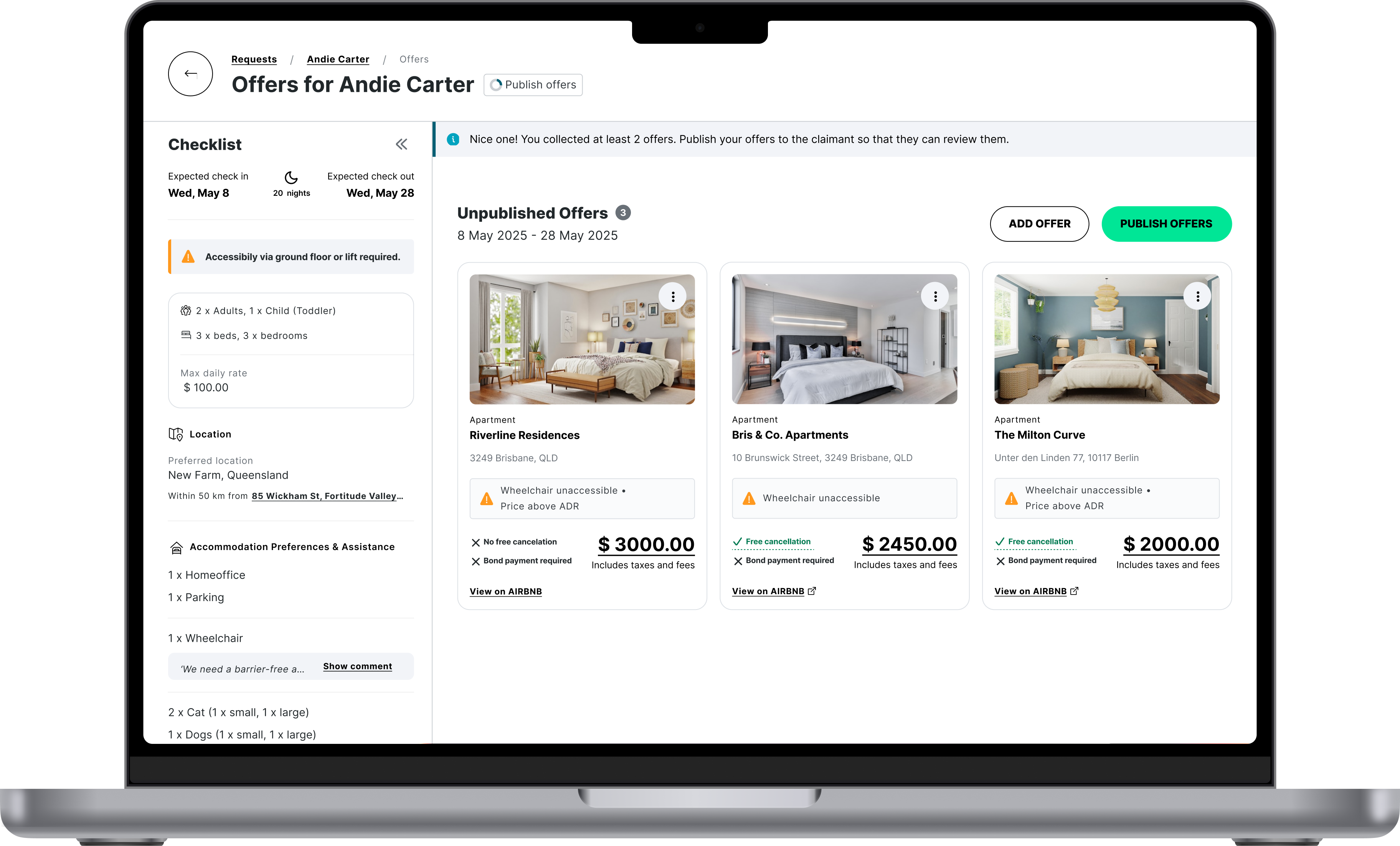
HRS Agents
Agents sourcing and proposing accommodation, balancing claimant needs and insurer requirements while reducing back-and-forth until a match is confirmed.

Claims Managers
Claims Managers handling temporary housing requests, deciding based on claim context, policy, and cost, often under SLA pressure.

Operations & Leadership
Operations Managers and leadership (e.g., COO) overseeing housing claims. They need a clear view of policy, cost, and outcomes to steer decisions.
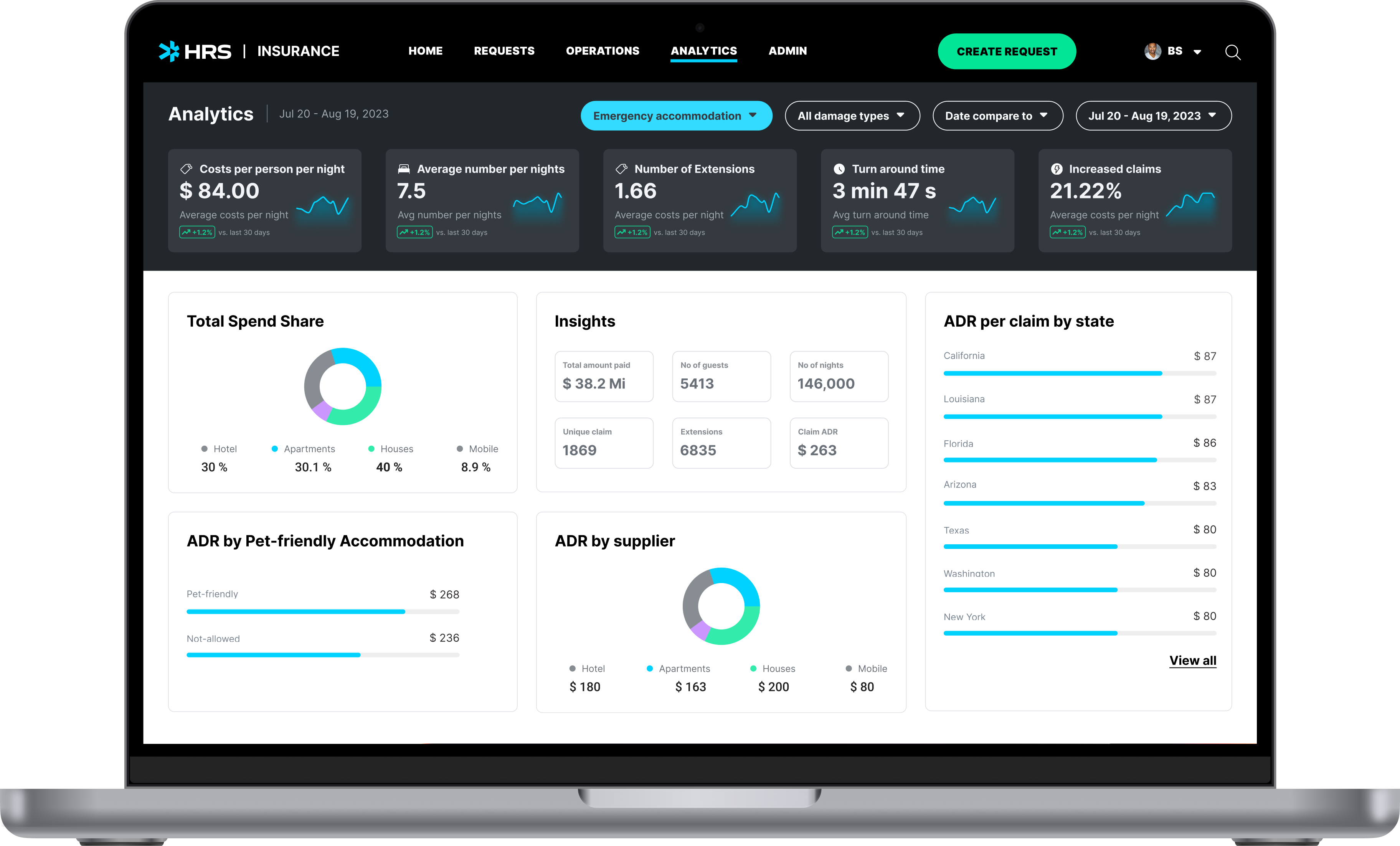
Business impact
Context matters
From acquisition to opportunity
In early 2019, HRS acquired LIDO and initially kept it running independently to enter the Australian insurance accommodation market, a space with frequent natural disasters and a clear need for scalable, reliable housing support. Over time, the operation continued largely "as is," with limited focus on improving internal workflows or the end-to-end claimant experience.
When HRS took a closer look, we identified a significant opportunity: the claims-to-housing journey was fragmented. There was no central source of truth, which meant claimants and claims managers frequently had to call or email just to understand what was happening, creating avoidable workload for agents and slowing down resolution.
The cost of fragmentation
This fragmentation also had real financial consequences. The time it took to move claimants from "incident" to "actual housing support" was often too long, increasing the likelihood of cash settlements from the insurer's perspective, when faster placement could have reduced cost and improved outcomes.
Why communication matters in crisis
Housing claims themselves happen under extreme pressure (fires, floods, sudden displacement). Claimants are navigating uncertainty, safety concerns, and time sensitivity. In these moments, communication isn't a "nice to have", it directly shapes trust, perceived control, and speed to resolution. With multiple stakeholders involved (claimant, claims manager, HRS agent, housing partners) and dependencies like approvals, documentation, and availability, it's easy for the claimant to feel left in the dark unless the process is intentionally designed to keep everyone aligned.

Current pain points
Lack of transparency
Claimants lack transparency into the process, unsure what's happening or what's next, driving anxiety and repeated outreach.
Fragmented journey
Claims managers (insurers) and HRS agents lose time re-explaining basics and providing status updates to claimants across fragmented channels.
Decision blind spots
Insurers can't make data-driven decisions because key case and persona data isn't consistently captured or tracked preventing pattern recognition, benchmarking.
Unmet SLA targets
Housing requests are submitted just to obtain a cost estimate. After proposals are sent, responses often don't follow leaving cases pending for a long time.
Outdated information
Inconsistent, outdated updates causing inbound interference in which HRS agents are constantly interrupted in solving problems for insurances and claimants.
How might we
make housing claim progress visible, actionable, and measurable for everyone involved?
Jump past solution to design processOne central platform as a shared reality
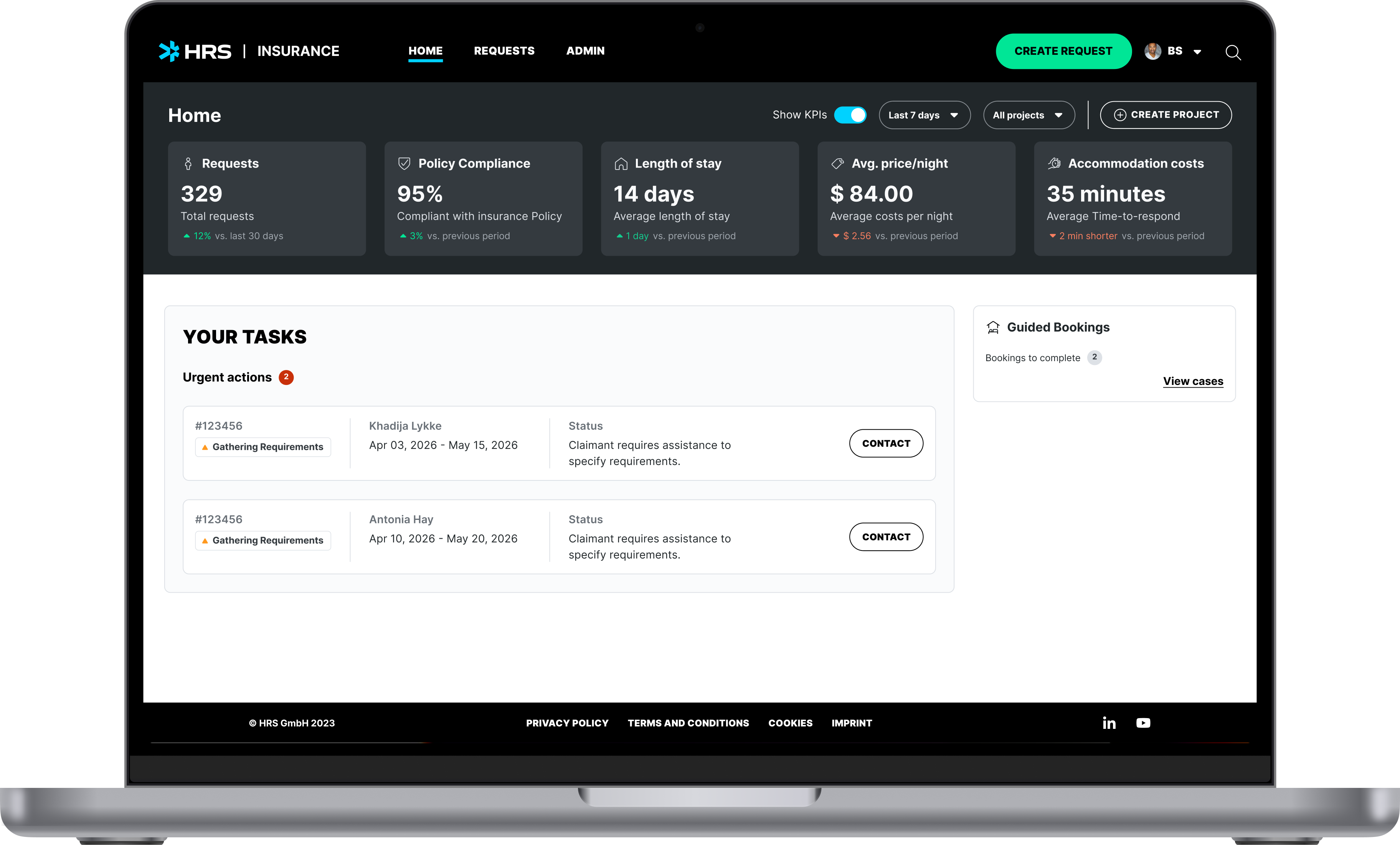
Claims Managers and HRS Insurance are now always aligned thanks to improved status identification and messaging. Users see their own tasks by default and can also filter for colleagues' tasks. Task history can be tracked and traced.
In user interviews, claims managers described spending significant time chasing colleagues to understand who owned what. Defaulting the view to the user's own tasks, with the option to filter others', came directly from that finding: people needed clarity on their own workload first, with team visibility as a secondary need.
Solution - The claimant experience
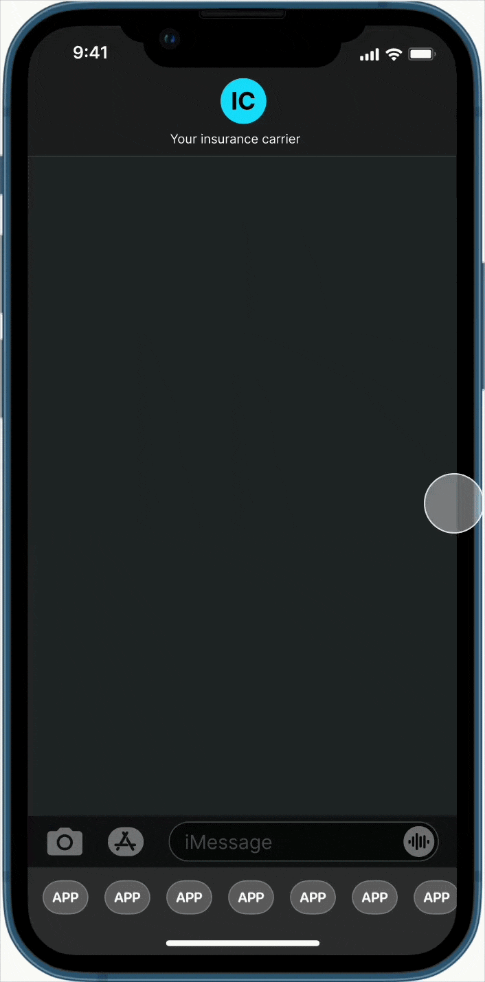
Silence is no option
Once the claims manager submits the claim, the user is sent a SMS stating to confirm their personal details. For an extra layer of security, the user enters a code.
Research showed claimants were often in transit or at emergency accommodation when the claim was filed, SMS was the only channel that didn't require them to be at a desk or already have the app.
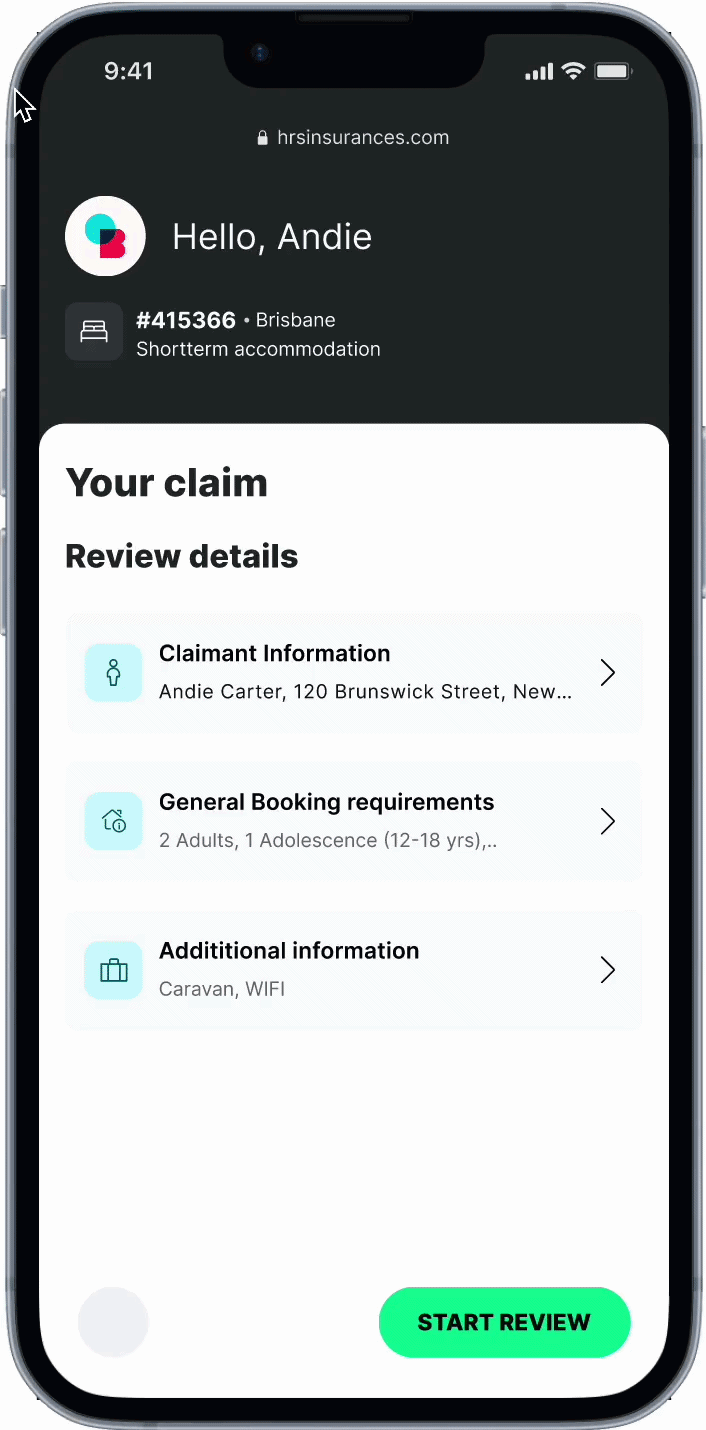
Confirm requirements within seconds
Instead of having to wait for an HRS agent to call up and confirm the housing requirements, the claimant is now enabled to do it themselves. Seeing them black and white raises confidence that the right information are obtained and suitable accommodation can be found.
In interviews, claimants repeatedly said they weren't sure their needs had been heard correctly. Showing requirements back to them in writing before any search began was a direct response to that anxiety.
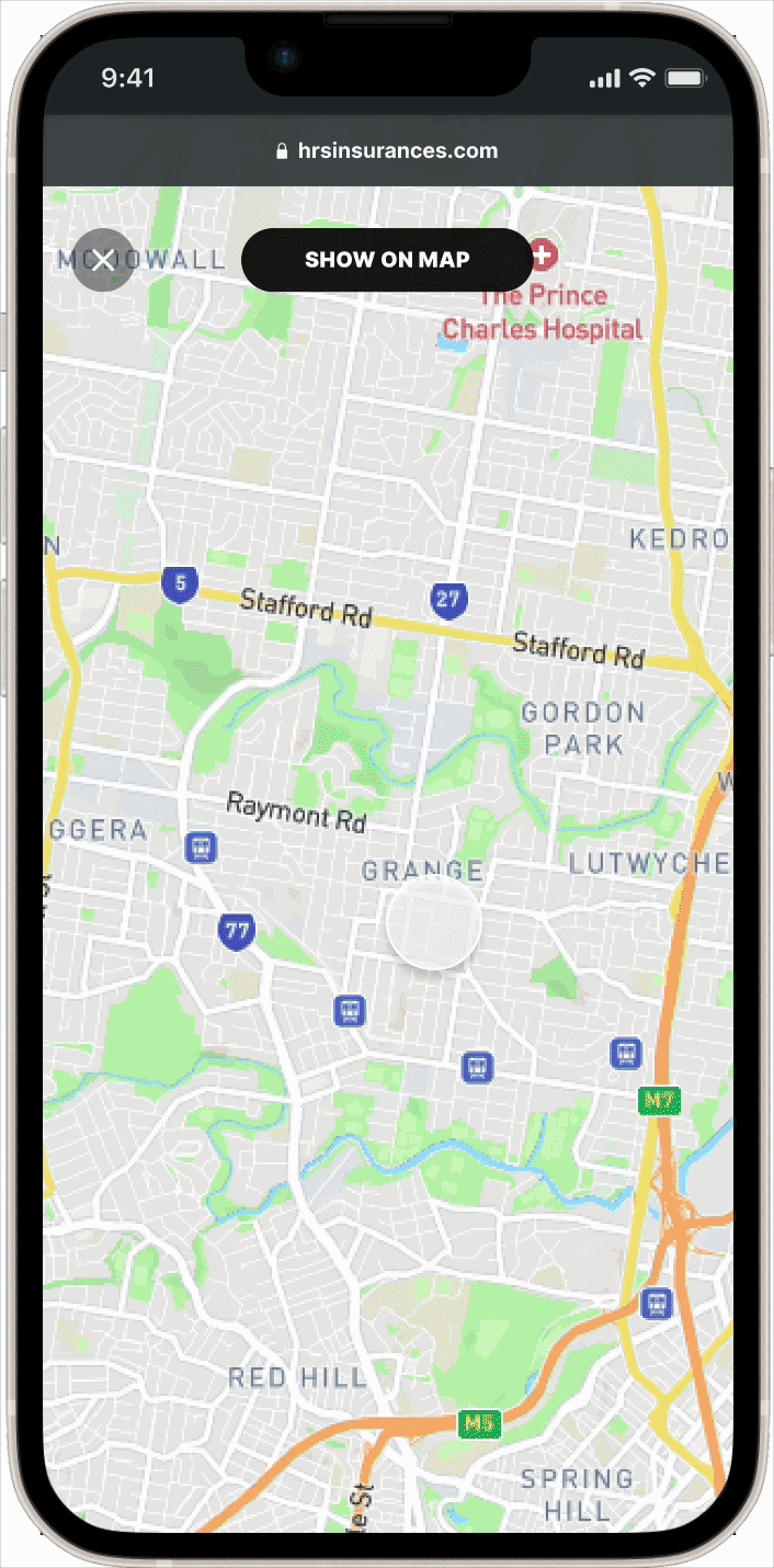
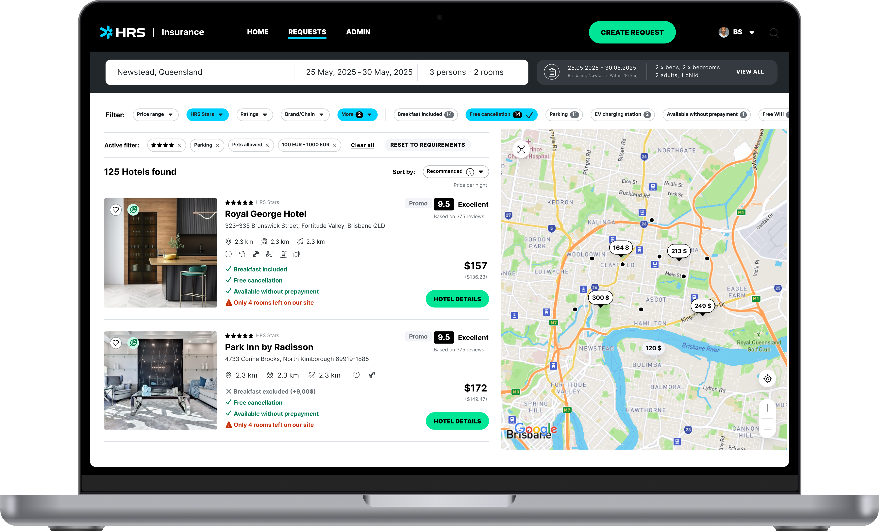
Choose the right place, first time
Instead of lengthy back-and-forth with an HRS agent to find the "right" home, claimants can review options themselves, select where they'll feel most comfortable, and follow the booking status through to confirmation.
Agents told us the most time-consuming part of their job was the back-and-forth of rejections. Giving claimants direct selection, with visible constraints like distance and room requirements, cut that loop before it started.
Design Process
Research: 14 interviews (4 agents, 5 claims managers, 5 claimants) + CSAT review + competitor analysis
Artifacts: UX discovery principles, current-state flow, future-state flow, prototype iterations, usability feedback themes
In order to discover the right thing and be sure to align with our business goals, I created principles that help me throughout my design process. These shape interview guidelines, creation of mock-ups.
Design for vulnerability
Clarity reduces stress in high-stakes moments.
- Plain-language "what happens next" + timelines
- Progress indicators + fewer, smarter inputs
- Respectful constraint capture (pets, mobility, school/work)
Signals: Higher self-serve completion · fewer escalations · higher in-claim CSAT
Decision UX that compounds
Each claim improves future prediction and reduces rework.
- Build explicit "decision points" (not hidden in free-text)
- Capture reason codes and constraints at decision time
- Make "why this option" visible (benchmark + needs fit + policy)
Signals: Reduced rework loops · higher first-time booking success · better cost predictability
Human-in-Control AI
Automate routine tasks, keep humans accountable and confident.
- Define automation boundaries: Auto / Assist / Escalate
- Surface AI confidence and uncertainty
- One-click escalation + clear handoff UX
Signals: Higher automation rate · lower NatCat failure rate · improved traceability
Build what we test
Production UI matches validated designs to protect usability.
- Design specs as testable contracts (components, states, edge cases)
- Real claim replays to validate friction points
- Each build slice tied to measurable outcomes
Signals: Reduced drop-off rates · faster iteration cycles · better prioritisation
Reflection
The biggest shifts in this project came from confronting real-world constraints, stressful claimant contexts, misaligned stakeholder language, and feasibility limits. Here are the lessons that most directly shaped the solution:
Design for the worst moment, not the average one
Claimants were displaced, on mobile, and stressed. We shifted to mobile-first, plain-language updates and multi-channel notifications.
B2B2C needs a shared language, not a shared interface
Different stakeholders used different terms for the same claim stage. We created a shared status vocabulary applied across role-based views.
Trust improves when you reflect requirements back
Claimants feared their needs weren't captured. We added a requirements confirmation moment before search, turning input into visible accountability.
Early feasibility alignment prevents late rework
Validated the to-be flow with Product + Engineering before prototyping, surfacing constraints early and accelerating iteration.
Next Steps
The portal is a major step forward, and it also surfaced the next set of opportunities. The most important remaining friction points are:
Manual intake creates friction
Claims managers still re-enter data, slowing down case start. We're exploring API-driven prefill and PDF-to-form extraction to reduce effort and errors.
Surge scenarios need validation
Catastrophe-scale usage hasn't been tested. Even with CSV upload, we need load + workflow stress testing to ensure the experience holds under pressure.
High-touch offer workflows
Offer management still depends on manual coordination. There's an opportunity to streamline with templated offers, bulk actions, and clearer states/ownership.
View other projects
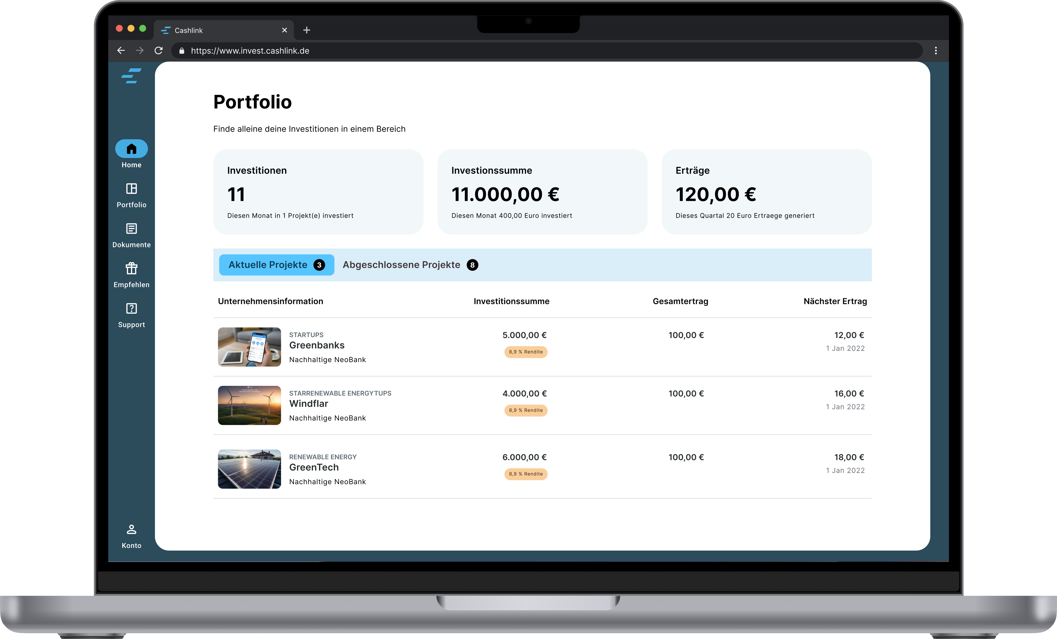
Cashlink
Coming soon